RGB, CMYK and what happens to colour before press
A screen makes colour by adding light. A press makes it by putting ink on paper and subtracting light. The two produce different sets of colours, and those sets are different shapes. Some of what a customer approved on their monitor cannot be printed by any press, on any stock, at any price.
Which leaves two questions: where in the workflow you deal with that, and who you tell.
What actually goes missing
Coated offset prints roughly half the colour an sRGB screen can show, and rather less than half of a wide-gamut one, which is now normal on the designer’s desk. The losses aren’t spread evenly.
The colours that survive best sit near the middle: skin tones, muted earths, most greys, the bulk of photographic subject matter. Process inks were chosen to reproduce photographs on paper, and they do that job well.
The ones that go first are the vivid, saturated edges of the screen gamut:
- Bright cyan-blues. The most common complaint. A saturated screen blue prints noticeably duller and often shifts toward purple.
- Vivid greens. There’s no green ink. Green is built from cyan and yellow, and the brightest screen greens sit outside what that mixture can reach.
- Saturated violets and deep purples. Same problem from the other side.
- Neons and fluorescents. Nothing in a four-colour process comes close, which is why fluorescent spot inks exist.
Orange and red are usually better behaved than customers expect, though the most saturated oranges still pull back.
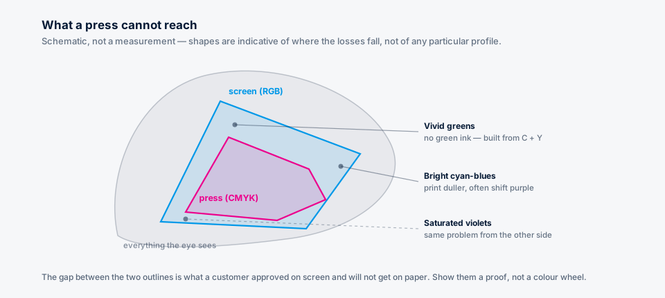
If a customer has picked a brand colour that sits outside the press gamut, put a printed proof next to their screen. That settles it in about ten seconds. Arguing about colour theory settles nothing.
Black is where it bites quietly
RGB black is 0,0,0 and it means one thing. In CMYK you have to decide what black is.
Left to a naive conversion, 0,0,0 becomes a four-colour build, so you get heavy ink from all four units in the same place. On a large solid panel that’s often what you want, because a rich black looks deeper than K alone. On 8pt body copy it causes trouble: four plates now have to register perfectly on every character, and any misregistration shows up as coloured fringing on the type.
A RIP with black preservation turned on maps RGB black back to K-only, which is what you want for text. Whether it’s switched on for your job depends on the conversion settings rather than anything in the file, so check it instead of assuming.
Dark greys are the related trap. Several near-black RGB values can converge on nearly the same CMYK value, so shadow detail that was distinguishable on screen arrives on the sheet as one flat tone, and nothing anywhere raises an error about it.
Total ink depends on the press and the stock
Lay down 100 per cent of all four inks and you have 400 per cent coverage, which no press will take. The sheet won’t dry, it sets off onto the next one, and on web work it can pull the paper apart.
Every press-and-stock combination has a maximum, and they vary widely. Coated sheetfed tolerates far more than newsprint. Get the number from whoever is printing it. A figure off a blog, this one included, is worth nothing next to the real answer from the shop running the job, and it’s the sort of number that changes with the stock you switched to last week.
A rich black built by eye in a design application can easily go over the limit. A conversion done with the right profile won’t, because the limit is baked into the profile.
Where the conversion belongs
As late as you can manage: in the RIP, with the profile for the press and stock the job is actually running on.
Converting to CMYK is destructive and irreversible. The moment you convert, every colour that sat outside the destination gamut is gone, and converting back doesn’t bring it home. Convert early, at the design stage or in a prepress tool that’s guessing, and you’ve committed to a press and a paper before either one was chosen. Change the stock after that and you’re left with a file optimised for the wrong thing and no way back to the original.
An ICC profile is a description of what a particular device does with particular numbers. Convert with a profile that describes the actual press and you get the best answer available. Convert with a generic one because it happened to be the default and you’ve made a decision on the customer’s behalf based on a guess.
Spot colours are the escape hatch. If a brand colour genuinely sits outside the process gamut and the customer won’t accept the nearest printable approximation, that’s what a spot ink is for. It costs a plate and a wash-up, which makes it a commercial decision more than a technical one. Saying you can’t hit that colour in CMYK is a legitimate answer and doesn’t need dressing up.
Where Print Prepper sits
Print Prepper doesn’t convert. The pipeline is RGB from end to end, no ICC profile is embedded and no CMYK conversion happens anywhere in it. What it does do is look at the source before rasterising and warn you when a file arrives carrying CMYK or spot colour information that will be lost.
That’s deliberate. A tool that doesn’t know your press has no business picking a profile on your behalf, at the wrong end of the workflow, and baking the result into a file you can’t undo. A warning puts the loss in front of you while the job is still open, instead of at the proof.
The conversion stays in your RIP, with your profiles, for your press. If your workflow needs it done upstream of that, Print Prepper isn’t the tool for that part of it, and you may as well find out now.
What to tell a customer
Three sentences, before the job starts:
Colours that look vivid on your screen may print duller, bright blues and greens especially. We will send a proof so you can see the printed result before we run it. If a brand colour has to match exactly, tell us now, because that may need a spot ink.
That conversation takes a minute at quoting time. Having it after the run instead can cost you the run. Resolution is the other half of the file check, and it’s covered here.